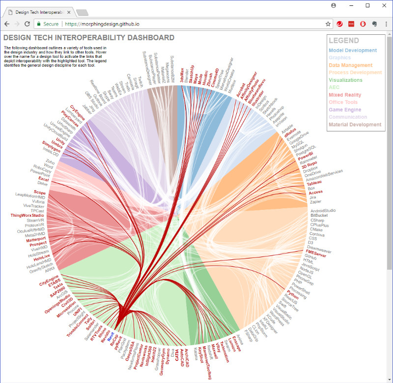
Over the past few years, I have been exploring a wide range of software for use in the architecture, building construction, web, and game industries. The applications extend through model authoring, construction documentation, database management, visualization, programming languages, and countless others. As new technology and methodologies emerge, the aim is to integrate them into existing production pipelines with the aim of streamlining and optimizing tasks. The result is an already large pool of tools that continues to grow exponentially that needs a system of logical organization for efficient integration.
One of the most common questions that I continuously get is how to transfer or relay data from one software or file format to another, directly or through multiple layers of tools, or if it is even possible. The recurring solution is to map out a pipeline between the starting software to the target software, and any intermediary software of integral file conversions. For example, the workflow among SketchUp, Rhino, and Revit defines a common file interchange process that warrants reinforcement as common knowledge in the architecture industry. This step of mapping them has become repetitive for me and I envision a visual dashboard that combines all of these into a cohesive map to serve as a resource for myself as well as to others exploring software interoperability.
Keeping track of existing tools and processes, while at the same time learning and integrating new ones, is the challenge. A tool and process map dashboard is the documentation strategy that I am proposing to resolve this ongoing challenge. It allows for users to select both the starting and targets software tools and the dashboard highlights the single, or multiple, pipelines available for the data transfer to work. Personally, this becomes a key resource for recalling critical information used daily, but I also envision the dashboard helping to serve as a representation of the tools and processes in which I have gained various levels of expertise, sort of like a live resume.
The following is my proposal and defines the current Work-in-Progress:
The dashboard is a web-based visualization programmed using HTML, CSS, and JavaScript with key interactive elements for users to explore the growing encyclopedic resource. The aim is to embody Murray’s “characteristics of the digital medium” through the procedural programming that defines the visual dashboard and enables user to participate through the spatial interface (Murray). Its web-based format allows for quick and easy access by all but would aim to specifically target working professionals and students in the various design industries.
This documentation entails a large amount of information ranging into the hundreds of tools and processes. As a result, it requires a hierarchy management system in which users interact with the dashboard through tiers to delve deeper into the specifics of their inquiry without being overwhelmed with extraneous information. The tiers reflect the different disciplines, including architecture, web, graphic design, game, etc., and the next layer of hierarchy go into greater detail within the selected discipline, and so on. With the limited view space in a web-based format, the selections through the hierarchy zoom into the different layers to isolate them from the others so the user can get to the information quicker.
Additional value is activated by hovering over the graphic representations of the tools and processes. A link to the tool’s source websites, a short description of the tool, and acceptable file formats appear to further inform the user about additional resources and the type of file formats that are permissible in each unique file interchange process. For example, hovering over the Autodesk Revit icon would present a link to Autodesk’s Revit resource website and a short description: Building Information Modeling authoring & analysis tool. Hovering over the arrows linking the tools would highlight the acceptable file formats.
The overwhelming amount of information is synthesized into an organized, interactive format that allows a user to quickly and intuitively reach the information needed to understand and implement efficient workflows in the design industry. Furthermore, it becomes an emergent resource that grows over time with new knowledge.
Works Cited
Murray, Janet H. Inventing the Medium. The MIT Press, 2011. XanEdu. Accessed 04 May 2018.
